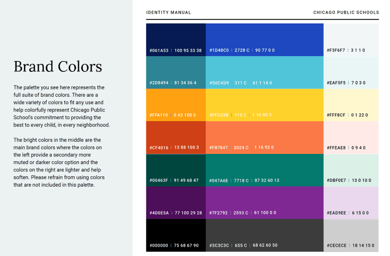
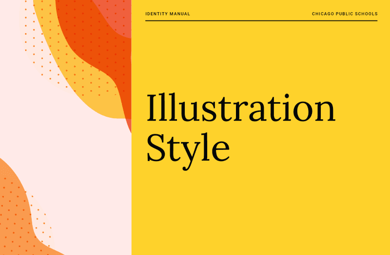
Chicago Public Schools
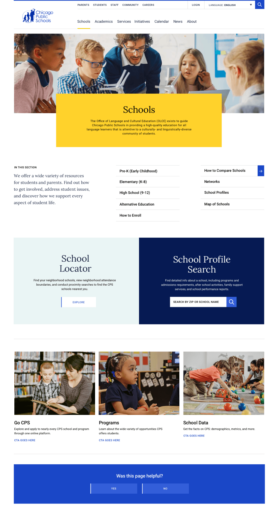
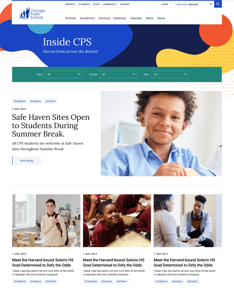
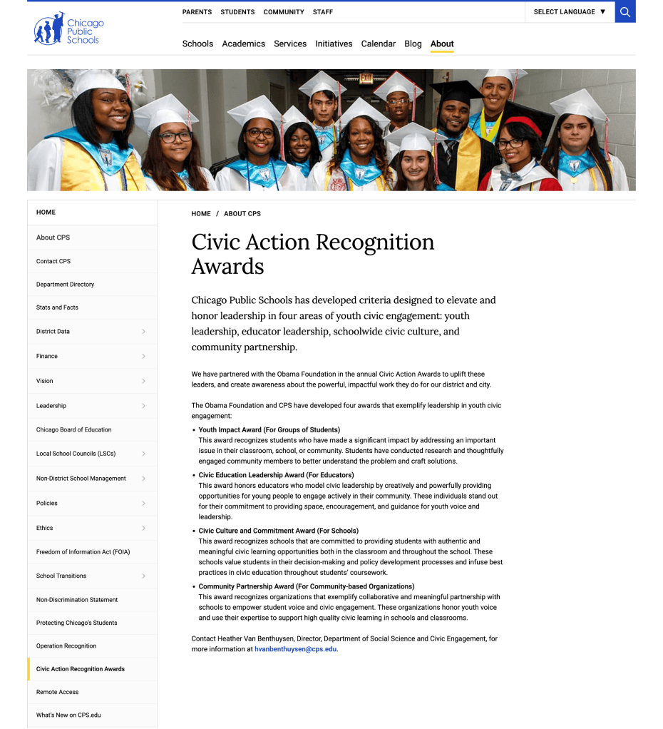
Home to over 360,000 students and 60,000 teachers and staff, Chicago Public Schools does not take change lightly. We helped CPS articulate a refreshed brand through their new website. The design had to function across storytelling, detailed app-like interfaces and simple informational pages, with over 900 different pages of content accounted for. We developed a design system that is content-first, with a modular structure that recedes into the background.
Client
Chicago Public Schools
Industry
Education
Services
Branding / Strategy / UX / Design


Standards
From our design system, we then helped them define best practices for photography, illustrations, typography and icons. We translated all of this work into a new website that combines whimsy and data into an inspiring user experience.
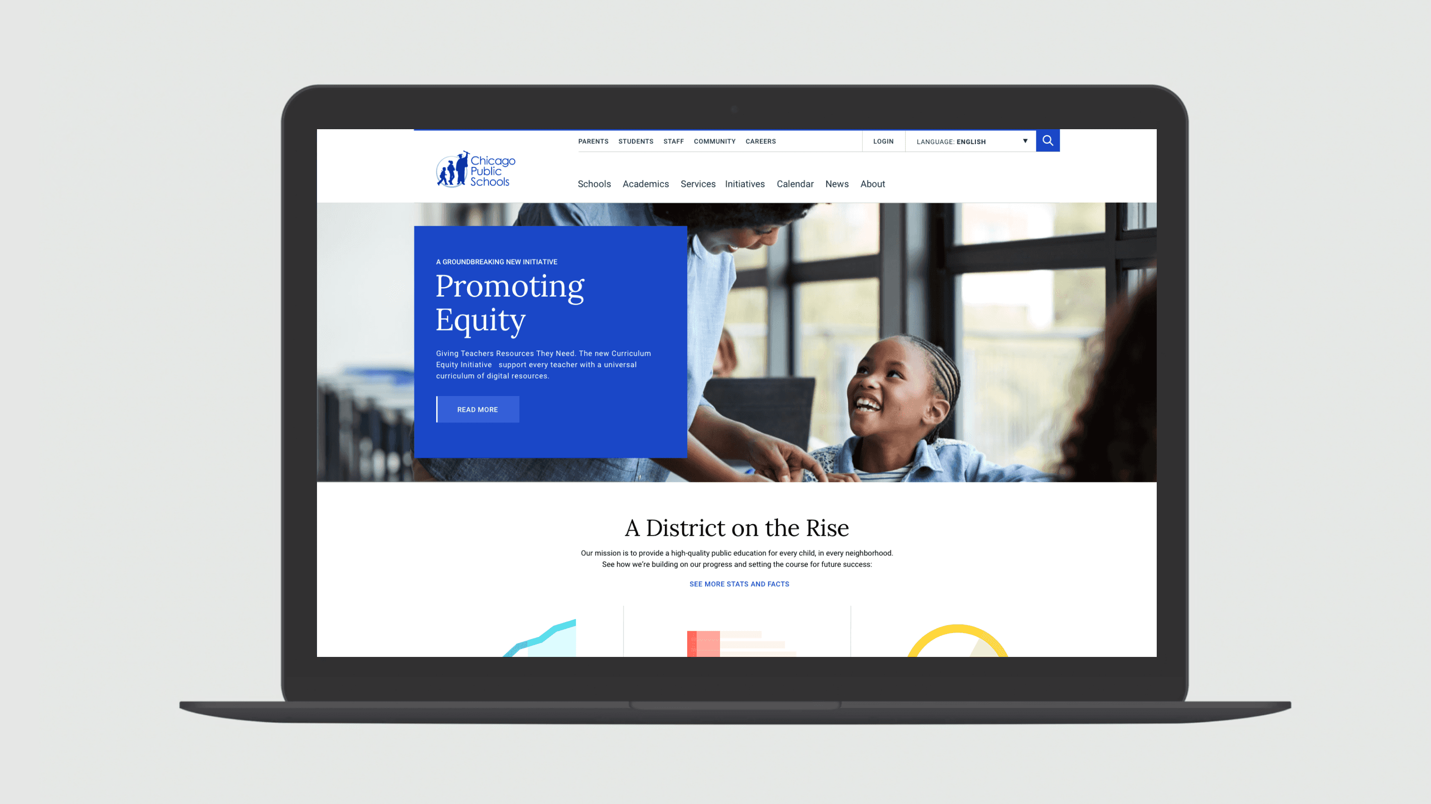
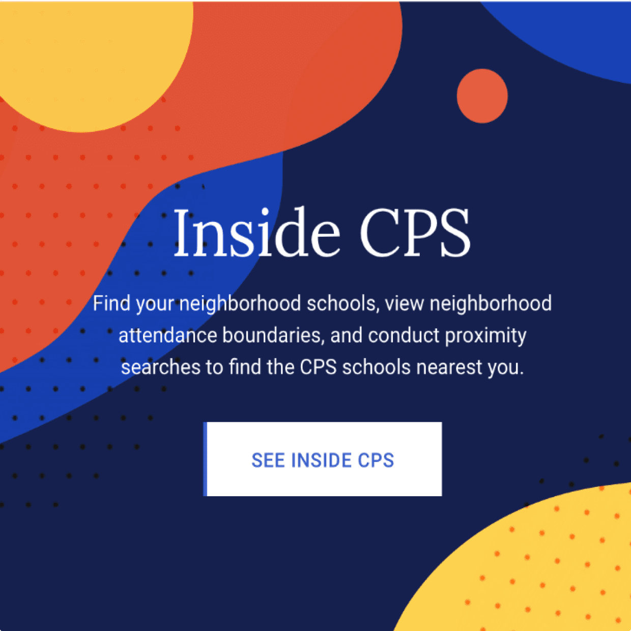



Engaging kids and parents.
With the CPS website, we had the unique challenge of designing for very text-heavy pages alongside very text-light ones. We designed for balance across the site by bringing washes of pastels and bright visuals to text-light pages, and plenty of white space and bold color to text-heavy ones.

Brand Guidelines
Once we had run our design system through the paces of developing a public-facing website, we codified the results in a set of digital brand guidelines for CPS to use as they continue to create new pages, microsites and other materials. These guidelines provide a foundation to ensure future marketing stays true to the essence of the brand.

